In the second part of this Back to Basics series, Paul Glatzel underlines the importance of understanding and using charts and a chartplotter when afloat …

Welcome to the second in this series of Back to Basics articles. Whether you are a newcomer to the wonderful world of powerboating or a salty old seadog, we hope that all of the articles in the series will teach you new things or rekindle a few old memories. 
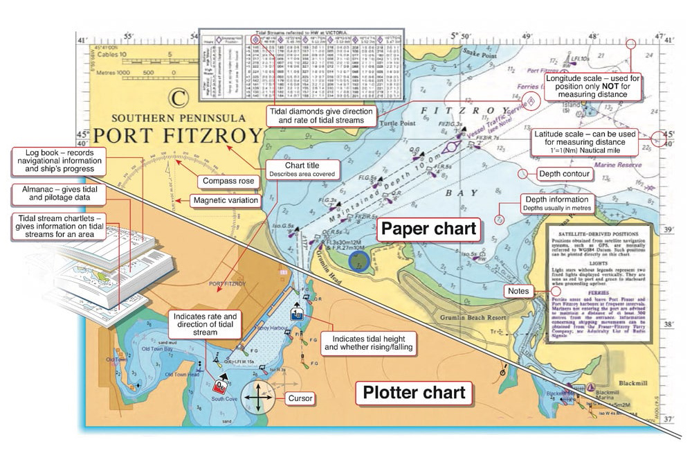
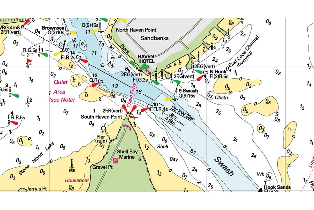
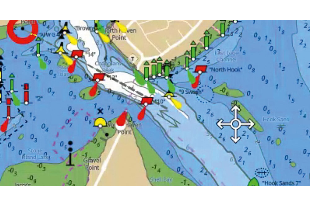
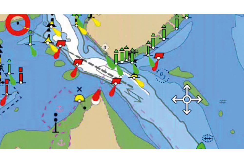
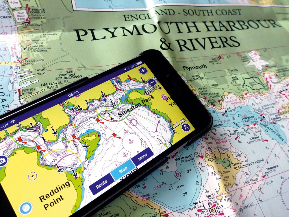
In this article we’re going to look at the subject of your chartplotter, or more specifically the underlying charts that show you what’s out there.

Pretty much every boat we see in the pages of PBR will be fitted with what manufacturers call a ‘multifunction display’ (MFD) and we all tend to refer to as a ‘chartplotter’. In reality, these do so much more than just exhibit charts (hence the term ‘MFD’), but in this article we’re going to look at the charts we see displayed on them that show us the area we are in or want to go to.

Even if your boat doesn’t have a chartplotter, this article will enhance your understanding of traditional paper charts as, in reality, whether we are looking at a paper chart, a huge chartplotter or a chart on our tablet or phone, we are looking at the same basic data. All that differs between them is the way that the data is displayed and how we view that information.

Comparing paper charts and plotter charts

Diagram 1

So let’s start with the basics: what is a chart? Basically a ‘chart’ is a nautical map of the sea and its immediate surroundings. The base data for such charts is generally sourced by a country’s hydrographic service, and that data is made available to be outputted in many ways. For years it’s obviously been in the form of paper charts, with various suppliers producing charts all carrying pretty much the same data but printed on different sizes of paper, with distinct colour schemes and covering different areas. Different ‘scales’ of charts address the need to have, say, a chart just covering a harbour or estuary versus one covering a long stretch of coastline.

So let’s look at some chart basics.

(See chart Diagram 1 ) When we look at a chart we see lots of information. Paper charts contain multiple notes and data whereas electronic ones will often have these but you tend to need to search them out by clicking on areas of the chart as they can be embedded within the menu. Both types use colours to represent what is always land (yellow or orange in these examples), what is always water (blue and white) and what may or may not be water depending on the height of the tide – ‘areas that dry’ (in green). Various symbols will show you features such as marinas, slipways or the buoyage that guides our journey, but also rocks and wrecks and the areas where we are more likely to experience turbulent water at certain states of the tide. Simply put, charts contain a wealth of useful, and often essential, information.

The numbers we see on charts show the ‘worst-case’ depths. Imagine it as if we push the tide down to the lowest level it gets to (what is called ‘lowest astronomic tide’) and take a photo – a chart is a ‘photo’ of that worst-case situation. Numbers like 34 mean, in this case, that the least depth is 3.4m plus tide; or 12 means it is 1.2m above that lowest tide. Be careful, though, as while with paper charts you need to add the tide to these numbers, on electronic charts the settings can sometimes be adjusted to show the numbers with the tide adjusted already. You need to know which you are looking at.

With the advent of electronic forms of viewing these charts (‘chartplotters’) we see this same data presented in lots of different ways according to the different brands of electronic chart suppliers. So what’s changed with electronic charts? Jumping forward to today, the charts we have in our chartplotters are pretty much as good as the paper versions, and all of the detail we see on our paper charts is there in the electronic versions. This may seem a pretty basic requirement, but in the earlier days of these electronic charts there were sometimes some material differences. What is different is what we can see at first glance.

An Imray chart – all the detail is always visible

An Imray chart – all the detail is always visible

With the charts we see on our plotters or tablets, we scroll in or out as required to fill the screen with the area we want to view. Doing so redraws the image. Newer systems do this pretty quickly, but older ones can be painfully slow. This zooming in and out also determines what level of detail you see, with far less of this detail being visible if you are scrolled out. This is in contrast to a paper chart where our brain does the scrolling and the level of detail is always there. Another factor, though, impacts what you see.

As previously mentioned, with a paper chart, what we see is what we get. With an electronic chart, you must make sure you know what level of detail you have set the chart to display. As you can see with these examples, even at the same scroll level the detail can be markedly different.

A Raymarine LightHouse Chart showing all layers of detail

A Raymarine LightHouse Chart showing all layers of detail

None of these issues are a problem as long as you appreciate that they are a factor and get on top of what your plotter is displaying. For those of you with plotters, when was the last time you looked at the menu, adjusted and played with the settings, switched on the setting that shows rocks (yes, on some systems these can be switched off!) and generally had a prod around in the menu system?

One of the great developments over the last couple of years is the ability of plotters to automatically update their software and, more importantly, the charts. Either by tethering to your phone or with their own embedded SIMs, they can ensure that you have the latest charts loaded. Yes, this will come at a cost, but it is well worth doing as things afloat can and do move, and invariably it is the things closer to shore that you are more likely to hit or go aground on.

A Raymarine LightHouse Chart showing reduced layers of detail

A Raymarine LightHouse Chart showing reduced layers of detail

As we covered in a recent article, apps such as savvy navvy and Navionics bring some excellent features to your tablet/smartphone and are well worth buying. They represent a great backup and are ideal for educating yourself about an area and for planning a trip. Apps from the likes of Garmin and Raymarine allow you to control and manage your on-board plotters, providing in effect a second station or an ability to sit away from the helm and manage the navigation of your boat.

Charts are an essential part of safe boating and enhance our enjoyment of being afloat by showing us new areas to get to, helping us to navigate close to shore and making the whole experience more relaxing. Like anything, though, they require time and effort if you are to make the most of them. Get stuck into yours and try to enhance your knowledge and understanding.

Keep safe and have a great time afloat!

Check out Powerboat and RIB TV Paul Glatzel and TMS discuss all aspects of getting afloat. The RYA Powerboat Handbook and the RYA Advanced Powerboat Handbook are available in print or as e-books from Amazon or the RYA shop at rya.org.uk/shop.

Read the full Back to Basics Series:

Back to Basics – Part 1: The ‘COLREGs’

Back to Basics Part 3: Tides

Back to Basics Part 4: Buoys and Pilotage

Back to Basics Part 5: Boat Handling

Learn more in our Tuition Section

Premier Marinas Dry Stack - Trafalgar Wharf

MDl Dry Stack
Henri Lloyd

Yamaha - The most exciting way to get from A to B campaign
Quarken 2023
Boatfolk May 2023